Back in the 1980s or early 1990s, I remember a motel that dropped out of the “Comfort Inn” chain. They reused existing signage by picking the name “Com-on Inn,” so they only had to replace a couple of letters. Something made me think of it recently, so I went looking to see if it was still around, or if I could at least find where it was.
DuckDuckGo didn’t find anything with the name (though when I did an image search, the broader criteria came up with a number of Comfort Inn locations). The closest Google suggested was a “C’mon Inn” in Grand Forks. I knew the general area it had to be in, so I went looking on Google Street View for something that looked right.
And I found it! A few blocks from where I thought it ought to be, and the building looked slightly different than I expected. But it’s in Monterey Park, next to a 7-11 (which jogged a memory), and the 2007 street view image is just barely legible enough to prove that even if I remembered the wrong location, I was right to remember that it actually existed!
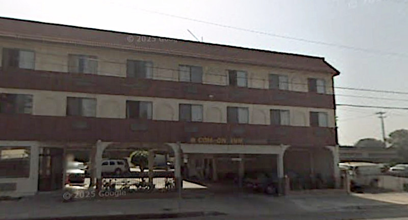
Between 2007 and 2012 it appears to have been rebranded as the Floral Inn, and sometime after 2017 it became a Motel 6.
Now I’m trying to think of other signs that have been reused like this. I know I’ve seen others! But at the moment, all I’m coming up with are entirely new signs placed in a distinctive rounded-triangle housing. I’ve seen enough of those that I seriously considered making a “Used To Be a Winchell’s” Tumblr in the previous decade!