…and sometimes, unreality is intentional and benign.
Today, Ars Technica posted an article with a header image featuring a keyboard modified to add an “Ars Subscribe” button. But the keyboard looked weird: the visible keys looked like this:
OPGU↵
LS.,
OC/[Ars Subscribe]
The extra letters, especially the two O keys, immediately drew accusations of AI slop generation.
And yet the image was credited to Aurich Lawson / Getty.
I figured Lawson had grabbed a stock image without noticing it was slop and then added the Subscribe button. So I did some reverse image searches. And it turned out that the apparent source photo was uploaded to iStockPhoto in 2016 (Getty owns iStock now), long before the advent of modern “AI” image generation.
That left the question of why the 2016 image had weird keys, though.
Then @lw replied on Mastodon that it matches a Turkish keyboard layout with the diacritics missing. I looked back at my search results and noticed another image that looked the same, only with the extra keys blanked out. The same account uploaded this one in 2018, and this time iStock had tagged it as having been uploaded from Turkey.
So, mystery (mostly) solved! It’s a real keyboard layout. Almost certainly a real photo, deliberately edited by hand to remove the extra markings. Why? Probably the original uploader figured it would be less distracting to a global audience. Who could have predicted that a decade later it would end up looking more suspicious because of it?
The discussion picked up in the article’s comment thread, where narteb found an even older version from 2014, still with the missing diacritics, but with a different action button and a darker (presumably original) skin tone on the finger.
A Proxy for Quality
It’s no surprise that readers were so quick to assume the photo was flat-out generated slop based on the apparent mismatch (not counting the obviously intentional subscribe button). “AI”-generated images have flooded the zone, and while there used to be some obvious tells — badly drawn hands, for instance — they’re getting to be a lot subtler.
Now we all second-guess everything we see, because to do otherwise would leave us open to being manipulated by falsehoods. And it’s not just knowing whether the image shows something real, but to know whether the image represents real human intention. The *ahem* key aspect of this image is the big red subscribe button, which is obviously not real, but it’s intentionally not real.
No one was under any illusion that the photo was an actual, unmodified keyboard. But when people assumed it was generated slop, they also assumed that was an indicator of laziness. When you see an article accompanied by an obviously junk image, you wonder, what else did they skimp on? Did they generate the article too? Did they research it properly? Did they fact-check it? This particular article was just a “here’s our new forum” announcement, but what about the other stuff that they publish?
Trust
Earlier this year, Ars retracted an article that contained fabricated, LLM-generated quotes. They fired the reporter and spent time developing an AI usage policy. This kind of thing burns trust, and trust is a news publication’s most important asset.
And it doesn’t even have to be a real mistake, or a real bias, to do damage. Conservatives spent decades painting NPR and PBS as some sort of bizarre “Marxist” strawman parody of what they actually broadcast, forcing them to dig out of a hole with large parts of their potential audience, until they’d lost enough trust that it became politically expedient to defund the networks.
Gut reactions and snap decisions have a purpose. But they’re still only heuristics. When we have time, it’s good to second-guess our impressions. Sometimes they’re wrong. Sometimes they’re right. But we have to look at those impressions clearly, not just spend the effort justifying the conclusion we’ve already reached. That’s something the human brain is also really good at, and when we’re cherry-picking evidence for the wrong conclusion, that makes things even worse.
I saw at least one commenter on the thread following up and insisting it couldn’t possibly be a Turkish keyboard, because those would have the diacritics on them, and this one doesn’t. It reminded me of the character in Mystery Men rejecting the idea that the Clark Kent expy couldn’t possibly be the Superman expy on the basis that he wears glasses, and not-Superman clearly has better eyesight than that.
Blaugust 2026: My Posts


 This year’s
 The teenager made a beeline for the video game room, only to discover that it was one person promoting his own games (which at least were interesting), a handful of old game consoles, and another person keeping track of a library of cartridges you could check out. It was cool to try out the old consoles, but the novelty wore off pretty quickly since the sparse attendence meant there wasn’t anyone to play the games with except when I joined him there. The other cool thing he found was an electronics workshop with circuit boards shaped like (among other things) caffeine and theobromine (chocolate) molecules, with LEDs and soldering stations where you could attach the LEDs yourself.
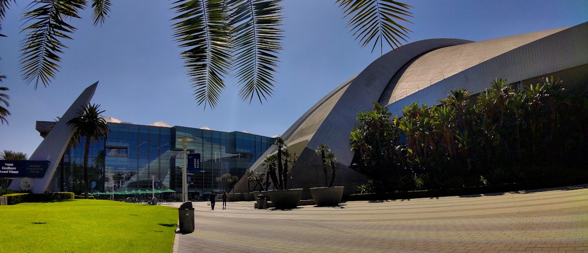
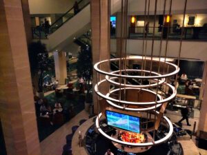 The con was split between the Hilton (which has been there forever) and the newest section of the convention center, next to the classic flying-saucer arena. (I think it was under construction the last time we were here for WonderCon.) Stylisticaly it looks like the expansion built in the 2000s: A curved full-height lobby with floor-to-ceiling windows, a lower level for general space, and an upper level. The difference is that the upper level is also big enough for general space, with portable walls to create breakout conference rooms. This meant even the hallways were gigantic, contributing to the feeling that, as Katie put it, the people were rattling around in a space too big for them.
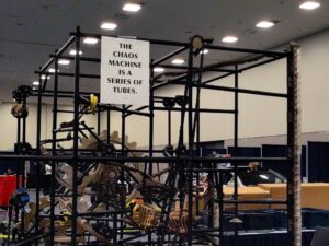 I had a few other panels that I was sort of interested in, but decided to prioritize going through the entire art show and making at least a single pass through the dealer’s room. I don’t regret that decision, because it meant I got to take my time really looking at the art. I didn’t buy much – a handful of books by guests and Hugo nominees, some stickers, a tote bag. They were out of T-shirts in most sizes, so I didn’t get the one they were selling onsite. (I bought the other design online afterward.)