One of the recurring questions when people familiar with HTML discover the Gemini protocol is: Why? Why not just write really simple HTML?

I came to see the appeal back in 2021, but taking a fresh look at Gopher this month, and actually building a basic Gopher site, helped me crystalize something:

It makes the most sense to look at Gemini and Gemtext in terms of the Gopher revival it came out of. It’s less “what do we want to throw out from the web?” and more “what bits of the web do we really miss when building with Gopher?”

So it ditches Gopher’s arcane menu syntax and strict menu/document hierarchy in favor of basic hypertext links that can be used anywhere. It adds word wrap, since we’re all using different-sized screens now, but makes it possible to keep ascii art/tables when needed. It welcomes global writing systems. Then it adds TLS for protection against eavesdropping.

The result is something that’s almost as minimalist as Gopher, but a lot more flexible. That makes it easier to get into than Gopher or hand-crafting your own website, plus it’s still usable on low-spec hardware or networks.

As a minimalist web, it seems lacking. As a web-enhanced response to Gopher, the goals are clearer.

See also: Project Gemini FAQ

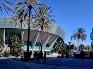
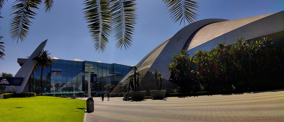
A round, flying-saucer-shaped building on a bright sunny day, flanked with palm trees.This year’s Worldcon, LAcon V in Los Angeles (well, Anaheim), felt small. And it wasn’t just comparing to older cons like Chicon 7 (2012) and LAcon IV (2006). I don’t know how much of it was that we only went on Sunday (the last Sunday in August), and how much of it was that the section of the convention center they booked was just way too big for the number of attendees, but I gather from what I’ve heard that it was in fact comparatively small for a Worldcon. (It’s also been suggested that some people who ordinarily would have traveled internationally to attend figured it might not be worth the risk.) I don’t know how anyone managed to catch Covid there.

At least the lines for the food trucks were short.

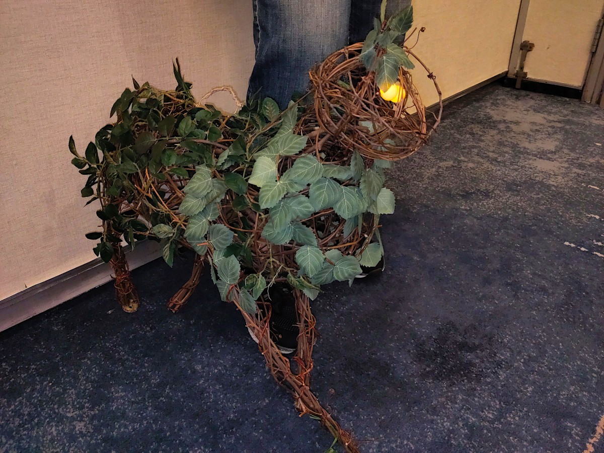
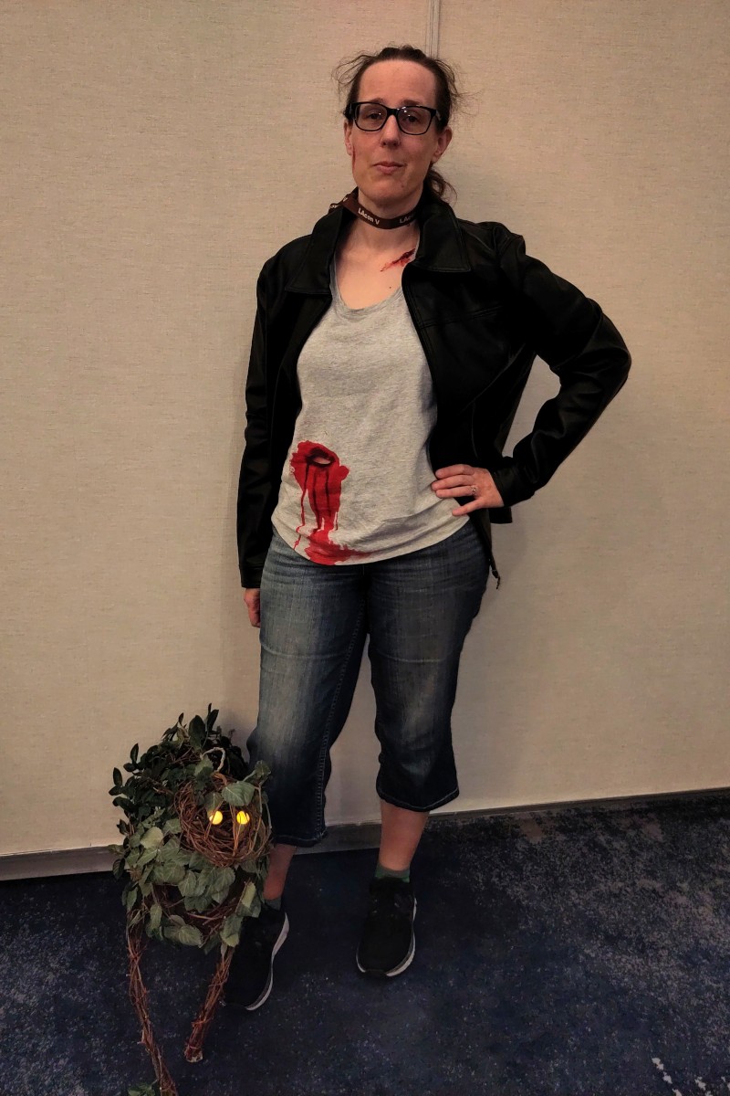
A world-weary woman in jeans, leather jacket, and bloodstained tank top with a stab hole through it, standing next to a cat-shaped creature (prop, not real) made of dried vines, leaves and thorns with a pair of glowing yellow eyes.I mentioned in the post about Katie’s October Daye cosplay that this was our first con since 2019. It was also our first general sci-fi/fantasy con in ages. More bookish, skewing older than comic cons, less cosplay. (There was more cosplay at the Undertale concert we went to on Friday the same weekend. A lot more.) Katie went to several panels on writing and worldbuilding, and I made sure to catch the Murderbot book-to-TV panel.

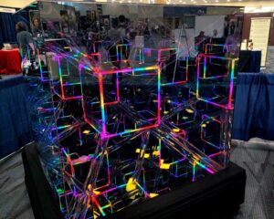
A sculpture of mirrors and LED strip lights, in the form of a hypercube tesseract, reflecting itself on and on forever.The teenager made a beeline for the video game room, only to discover that it was one person promoting his own games (which at least were interesting), a handful of old game consoles, and another person keeping track of a library of cartridges you could check out. It was cool to try out the old consoles, but the novelty wore off pretty quickly since the sparse attendence meant there wasn’t anyone to play the games with except when I joined him there. The other cool thing he found was an electronics workshop with circuit boards shaped like (among other things) caffeine and theobromine (chocolate) molecules, with LEDs and soldering stations where you could attach the LEDs yourself.
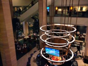
Looking down at the atrium of a hotel lobby. Ringed lights rise above a bar in the center, surrounded by cushy seating areas. A couple of balconies are visible along the inner walls and a staircase or escalator climbs diagonally across the far side.The con was split between the Hilton (which has been there forever) and the newest section of the convention center, next to the classic flying-saucer arena. (I think it was under construction the last time we were here for WonderCon.) Stylisticaly it looks like the expansion built in the 2000s: A curved full-height lobby with floor-to-ceiling windows, a lower level for general space, and an upper level. The difference is that the upper level is also big enough for general space, with portable walls to create breakout conference rooms. This meant even the hallways were gigantic, contributing to the feeling that, as Katie put it, the people were rattling around in a space too big for them.
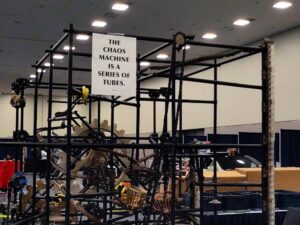
6-foot-high scaffolding for a marble run.I had a few other panels that I was sort of interested in, but decided to prioritize going through the entire art show and making at least a single pass through the dealer’s room. I don’t regret that decision, because it meant I got to take my time really looking at the art. I didn’t buy much – a handful of books by guests and Hugo nominees, some stickers, a tote bag. They were out of T-shirts in most sizes, so I didn’t get the one they were selling onsite. (I bought the other design online afterward.)

Katie met up with one of her friends, and a family friend I hadn’t seen in years turned out to be helping run registration. Otherwise we didn’t run into anyone we know this time.

The only book I brought for autographs was Good Omens (the Ineffable Graphic Novel), because I hadn’t make time to look through the guest list. Instead, I hastily tossed stuff in my backpack the morning of the con while Katie splashed fake blood on herself for her costume. I remembered Colleen Doran was there, and figured anyone else doing signings I could probably buy something at the con. Most of Sunday’s signings were authors or artists I didn’t know, but I did manage to find Doran’s booth toward the end of the afternoon!

Photo Gallery on Flickr

A round building in the foreground, and a wavy-looking glass building in the background, with palm frons reaching down from the top of the frame.

I finally went in for a sleep study. These days they start with a night of at-home monitoring. Not only is it simpler, but you’re sleeping somewhere familiar, so the results are going to be more representative. This place at least uses a medical-grade monitoring ring and a phone app to collect and report the data.

Easy, right?

Well, first let’s say I’m glad I keep a micro-USB cable for charging the Kobo and my power brick.

Seeking Compatibility

Second, there was the problem of pairing the device.

The app installed happily on my FairPhone 4, but no matter what I did, it just wouldn’t pair with the ring. I don’t know if there was some extra permission I missed, or if the app relies on Google services in a way that microG can’t handle.

Last week I got the Pixel 5 back from the repair shop that replaced the fire-hazard battery. I thought, well, I’ll try that. But the first thing I did when I got the phone home was install /e/OS on it (since mainstream Android is no longer supported on it, but /e/OS is). So that didn’t work either.

OK, how about I dig out my tablet that’s running stock Android? Nope, too old. The app wouldn’t even install. Same with Katie’s phone.

If it had been earlier in the day, I would have considered reinstalling stock Android on the Pixel 5.

In the end, I borrowed our son’s iPad. The app installed, and it paired immediately. I wore the ring overnight, kept waking up with my hand numb because I’d pinched a nerve or slept on it funny, and in the morning I hit Stop and uploaded the results.

Our Own Devices

The system is simple…if you have a up-to-date, mainstream mobile device to pair it with. We’ve been hanging onto older devices on the “If it ain’t broke, don’t replace it” principle.

I guess in a way they are “broken,” and so is the nonstandard replacement, under some circumstances. At least we can buy newer hardware. Not everyone’s in that position. I just don’t want to have to.

I’m beginning to think I should put stock Android back on the Pixel, until Android 14 becomes too old to run things, just to keep it on hand for situations like this. Like keeping a Windows partition on your Linux box. Except it has to be an extra physical device.

I have very few memories of Gopher when it was current. It was already on its way out when I started college. The course catalogs and a few other things were available, but not much else, and if they ever offered student gopher space, I don’t remember it. I don’t even remember for sure if the student web space was available my first year or if they added that the second year.

So I missed Gopher’s heyday (such as it was). And I was fully enmeshed in the blogosphere when the gopher revival started. I hadn’t even heard of a “phlog” until I discovered the Gemini Protocol in 2021, and read about how in a way it was a reaction to that Gopher revival, trying to build something that was almost as simple, but with a few key features backported from the web. (Hyperlinks, some very minimal formatting, TLS to prevent eavesdropping, and general user input.)

I got out of Gemini for a while as I focused on my website again, then came back to it (but not as thoroughly). A blog post by Brennan Kenneth Brown, Gemini, Gophers and Fingers, Oh My! got me thinking about Gopher again.

And then I got stopped by the most trivial stumbling block ever: Naming. I felt like I needed to set up a Gopher presence before really diving in. And I wanted to just use my domain name like I do with my website and Gemini capsule…but Gopher listens on a protected port. That means I can’t run a server in the userspace on my webhost. I have to run it on something I have root access to (or else let someone else manage the software, which I probably should’ve started with). And the idea of typing this:

	gopher gopher://gopher.kvibber.com

just seemed absurd.

(Then again, maybe it’s not that trivial. There’s a reason for the classic phrase about the only really hard problems in computing being naming things and cache invalidation. And off-by-one errors.)

Eventually I got around to asking on the Fediverse, a place with a large population of Old Internet People like myself (and older): What naming conventions did people use for Gopher sites back then?

The consensus was that most sites just used a gopher prefix.

Though I did contemplate some sort of pun like pocket or botta (as in Botta’s Pocket Gopher, the most common one I see here in the Los Angeles area according to the rare photo I catch and post to iNaturalist).

Anyway, a follow-up to Brown’s post the other day prompted me to just build something.

I pointed gopher.kvibber.com to one of my VPSes, picked a reasonably current (by Gopher standards) piece of server software (Gophernicus, latest release 2020), and promptly discovered that not only is Gophernicus not available directly in Alpine Linux, but it relies on a system network listener (inetd, xinetd, systemd), and Alpine doesn’t install any of those by default. So
I figured out how to get inetd running on Alpine, built Gophernicus and started it up.

I’ve pulled in a few pages from my Gemini capsule to start with. And now that I have that place to start, I feel like going exploring.

Originally posted on gopher.kvibber.com.

Last weekend we went to WorldCon / LAcon V for a day. It was our first convention since 2019 (for, you know, reasons), and Katie finally got to build a rose goblin and cosplay as October Daye, something she’s been planning to for years. (Basically since we were gifted the jacket.)

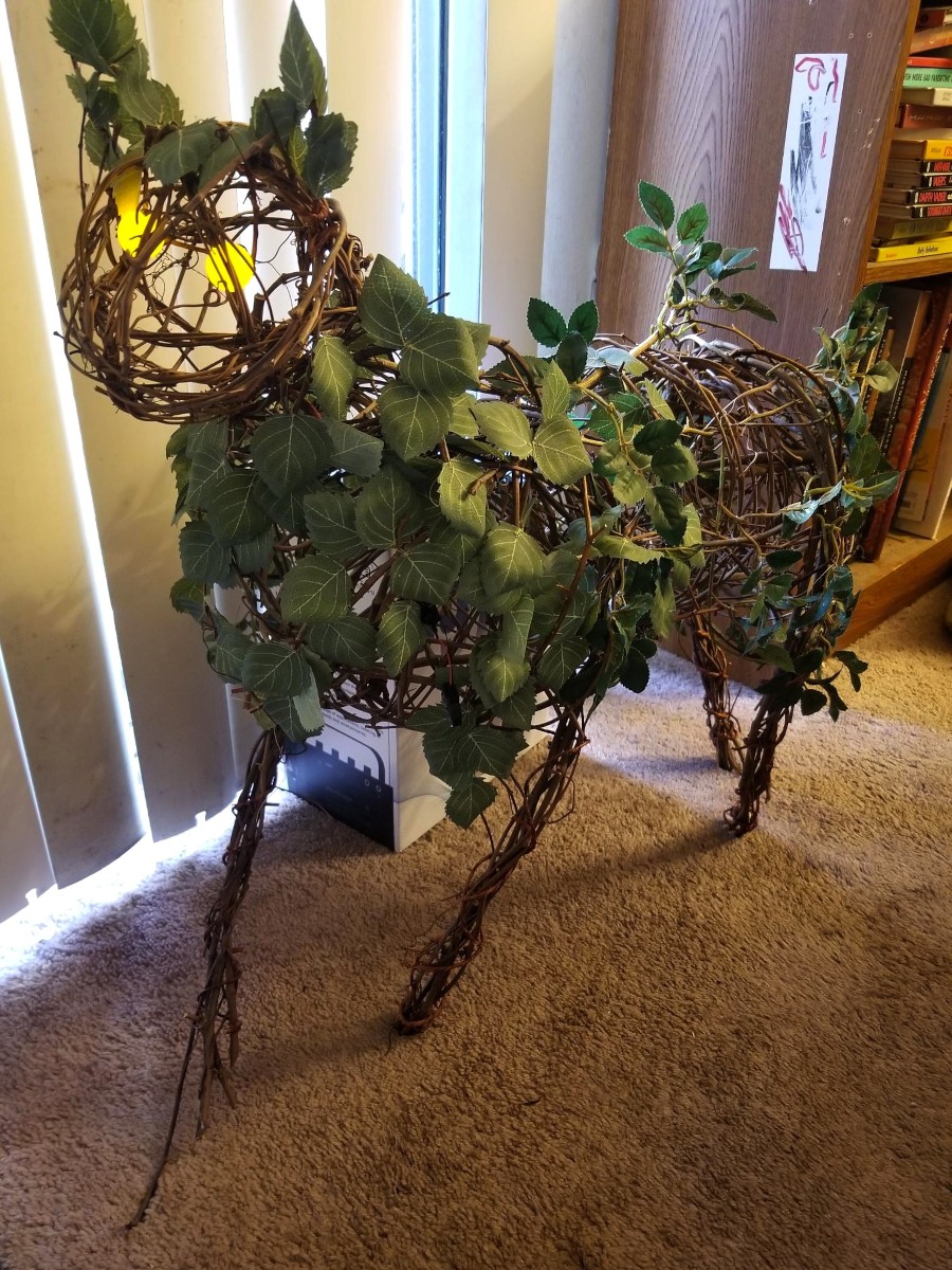
Spike is described in the books as a cross between a rose bush and a cat. Three craft store grape-vine wreaths, soaked for reshaping, give it structure. Bougainvillea vines are woven through it to add thorns, though she ended up trimming them so it wouldn’t be hazardous if someone grabbed it, or if someone else’s costume brushed up against it. (We both managed to stab ourselves on the thorns while she was making it.) She cut a bunch of artificial leaves to look like rose leaves, and sewed them onto the vines.

For the eyes, a pair of LEDs are hooked up to a battery (the switch hidden under leaves) and placed inside mini ping-pong balls, held in place inside the head by wire.

Originally she was planning to put it on a skateboard and pull it along behind her, holding it on using magnets and washers, but the magnets turned out not to be strong enough. So the day before the con, she scrapped the skateboard and built a handle into Spike’s back so she could carry it around. It turned out to be better anyway, since the skateboard wouldn’t have gone on an escalator!

…and sometimes, unreality is intentional and benign.

Today, Ars Technica posted an article with a header image featuring a keyboard modified to add an “Ars Subscribe” button. But the keyboard looked weird: the visible keys looked like this:

OPGU↵
LS.,
OC/[Ars Subscribe]

The extra letters, especially the two O keys, immediately drew accusations of AI slop generation.

And yet the image was credited to Aurich Lawson / Getty.

I figured Lawson had grabbed a stock image without noticing it was slop and then added the Subscribe button. So I did some reverse image searches. And it turned out that the apparent source photo was uploaded to iStockPhoto in 2016 (Getty owns iStock now), long before the advent of modern “AI” image generation.

That left the question of why the 2016 image had weird keys, though.

Then @lw replied on Mastodon that it matches a Turkish keyboard layout with the diacritics missing. I looked back at my search results and noticed another image that looked the same, only with the extra keys blanked out. The same account uploaded this one in 2018, and this time iStock had tagged it as having been uploaded from Turkey.

So, mystery (mostly) solved! It’s a real keyboard layout. Almost certainly a real photo, deliberately edited by hand to remove the extra markings. Why? Probably the original uploader figured it would be less distracting to a global audience. Who could have predicted that a decade later it would end up looking more suspicious because of it?

The discussion picked up in the article’s comment thread, where narteb found an even older version from 2014, still with the missing diacritics, but with a different action button and a darker (presumably original) skin tone on the finger.

A Proxy for Quality

It’s no surprise that readers were so quick to assume the photo was flat-out generated slop based on the apparent mismatch (not counting the obviously intentional subscribe button). “AI”-generated images have flooded the zone, and while there used to be some obvious tells — badly drawn hands, for instance — they’re getting to be a lot subtler.

Now we all second-guess everything we see, because to do otherwise would leave us open to being manipulated by falsehoods. And it’s not just knowing whether the image shows something real, but to know whether the image represents real human intention. The *ahem* key aspect of this image is the big red subscribe button, which is obviously not real, but it’s intentionally not real.

No one was under any illusion that the photo was an actual, unmodified keyboard. But when people assumed it was generated slop, they also assumed that was an indicator of laziness. When you see an article accompanied by an obviously junk image, you wonder, what else did they skimp on? Did they generate the article too? Did they research it properly? Did they fact-check it? This particular article was just a “here’s our new forum” announcement, but what about the other stuff that they publish?

Trust

Earlier this year, Ars retracted an article that contained fabricated, LLM-generated quotes. They fired the reporter and spent time developing an AI usage policy. This kind of thing burns trust, and trust is a news publication’s most important asset.

And it doesn’t even have to be a real mistake, or a real bias, to do damage. Conservatives spent decades painting NPR and PBS as some sort of bizarre “Marxist” strawman parody of what they actually broadcast, forcing them to dig out of a hole with large parts of their potential audience, until they’d lost enough trust that it became politically expedient to defund the networks.

Gut reactions and snap decisions have a purpose. But they’re still only heuristics. When we have time, it’s good to second-guess our impressions. Sometimes they’re wrong. Sometimes they’re right. But we have to look at those impressions clearly, not just spend the effort justifying the conclusion we’ve already reached. That’s something the human brain is also really good at, and when we’re cherry-picking evidence for the wrong conclusion, that makes things even worse.

I saw at least one commenter on the thread following up and insisting it couldn’t possibly be a Turkish keyboard, because those would have the diacritics on them, and this one doesn’t. It reminded me of the character in Mystery Men rejecting the idea that the Clark Kent expy couldn’t possibly be the Superman expy on the basis that he wears glasses, and not-Superman clearly has better eyesight than that.

Blaugust 2026: My Posts