
I didn’t manage daily blogging past day 12, or 31 posts in the month. I wrote 20 posts, including reviews of two books, a game, my dying phone and its replacement. I also finished some older drafts and revived my dormant Les Mis blog with a Star Trek post (really). Read More…
Tag: Blaugust
Sometimes Reality is Unrealistic…
…and sometimes, unreality is intentional and benign.
Today, Ars Technica posted an article with a header image featuring a keyboard modified to add an “Ars Subscribe” button. But the keyboard looked weird: the visible keys looked like this:
OPGU↵
LS.,
OC/[Ars Subscribe]
The extra letters, especially the two O keys, immediately drew accusations of AI slop generation.
And yet the image was credited to Aurich Lawson / Getty.
I figured Lawson had grabbed a stock image without noticing it was slop and then added the Subscribe button. So I did some reverse image searches. And it turned out that the apparent source photo was uploaded to iStockPhoto in 2016 (Getty owns iStock now), long before the advent of modern “AI” image generation.
That left the question of why the 2016 image had weird keys, though.
Then @lw replied on Mastodon that it matches a Turkish keyboard layout with the diacritics missing. I looked back at my search results and noticed another image that looked the same, only with the extra keys blanked out. The same account uploaded this one in 2018, and this time iStock had tagged it as having been uploaded from Turkey.

So, mystery (mostly) solved! It’s a real keyboard layout. Almost certainly a real photo, deliberately edited by hand to remove the extra markings. Why? Probably the original uploader figured it would be less distracting to a global audience. Who could have predicted that a decade later it would end up looking more suspicious because of it?
The discussion picked up in the article’s comment thread, where narteb found an even older version from 2014, still with the missing diacritics, but with a different action button and a darker (presumably original) skin tone on the finger.
A Proxy for Quality
It’s no surprise that readers were so quick to assume the photo was flat-out generated slop based on the apparent mismatch (not counting the obviously intentional subscribe button). “AI”-generated images have flooded the zone, and while there used to be some obvious tells — badly drawn hands, for instance — they’re getting to be a lot subtler.
Now we all second-guess everything we see, because to do otherwise would leave us open to being manipulated by falsehoods. And it’s not just knowing whether the image shows something real, but to know whether the image represents real human intention. The *ahem* key aspect of this image is the big red subscribe button, which is obviously not real, but it’s intentionally not real.
No one was under any illusion that the photo was an actual, unmodified keyboard. But when people assumed it was generated slop, they also assumed that was an indicator of laziness. When you see an article accompanied by an obviously junk image, you wonder, what else did they skimp on? Did they generate the article too? Did they research it properly? Did they fact-check it? This particular article was just a “here’s our new forum” announcement, but what about the other stuff that they publish?
Trust
Earlier this year, Ars retracted an article that contained fabricated, LLM-generated quotes. They fired the reporter and spent time developing an AI usage policy. This kind of thing burns trust, and trust is a news publication’s most important asset.
And it doesn’t even have to be a real mistake, or a real bias, to do damage. Conservatives spent decades painting NPR and PBS as some sort of bizarre “Marxist” strawman parody of what they actually broadcast, forcing them to dig out of a hole with large parts of their potential audience, until they’d lost enough trust that it became politically expedient to defund the networks.
Gut reactions and snap decisions have a purpose. But they’re still only heuristics. When we have time, it’s good to second-guess our impressions. Sometimes they’re wrong. Sometimes they’re right. But we have to look at those impressions clearly, not just spend the effort justifying the conclusion we’ve already reached. That’s something the human brain is also really good at, and when we’re cherry-picking evidence for the wrong conclusion, that makes things even worse.
I saw at least one commenter on the thread following up and insisting it couldn’t possibly be a Turkish keyboard, because those would have the diacritics on them, and this one doesn’t. It reminded me of the character in Mystery Men rejecting the idea that the Clark Kent expy couldn’t possibly be the Superman expy on the basis that he wears glasses, and not-Superman clearly has better eyesight than that.
Lunar Eclipse vs. Summer Gloom
It’s been gloomy all day – the kind of August day that’s hot, humid and still, sapping all your energy because nothing *actually* cools you off except real air conditioning (or standing in front of the refrigerator), not even taking a cold shower in the afternoon. At least the nights are still cooling off, even if the days are muggy.
Close to sunset, the clouds finally started to break up, and I began to think I might get to see tonight’s lunar eclipse after all.

That’s looking west. The clouds to the east were still a bit more solid, but low to the horizon, and by the time the moon cleared the rooftops and the eclipse was well underway, the clouds had broken up enough to see!
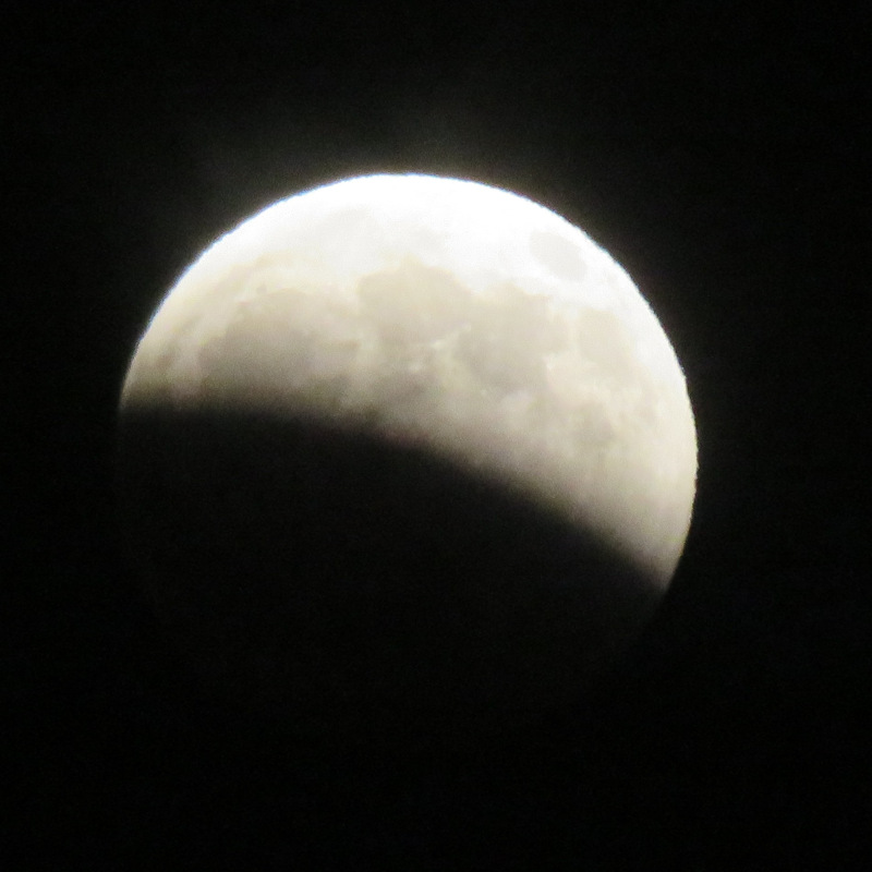
I took the sunset clouds shot with my Fairphone, which did a lot better than I expected, though I only managed to get misshapen blobs when shooting the moon. It’s been hectic enough that I didn’t try to set up the good camera. The point-and-shoot Canon with real optics does okay with the moon, as you can see here. (The teen’s iPhone, however, was able to get at least a couple of shots where the maria are visible. Not as good as the Canon, but better than any of my phones have managed.)
We went back inside, waited a while, went back outside, took some more photos, talked with the neighbors who were also looking at the moon, went back inside, rinse, repeat. Lunar eclipses are a lot more accessible than solar ones. They’re slower, since the Earth’s shadow is around 3 times the size of the moon at that distance. They’re visible from anywhere with a view of the moon, not just a narrow track. You don’t need eye protection. And unlike solar eclipses, a partial lunar eclipse is almost as cool as a total one. A lot of the time you can just walk out into your front yard.
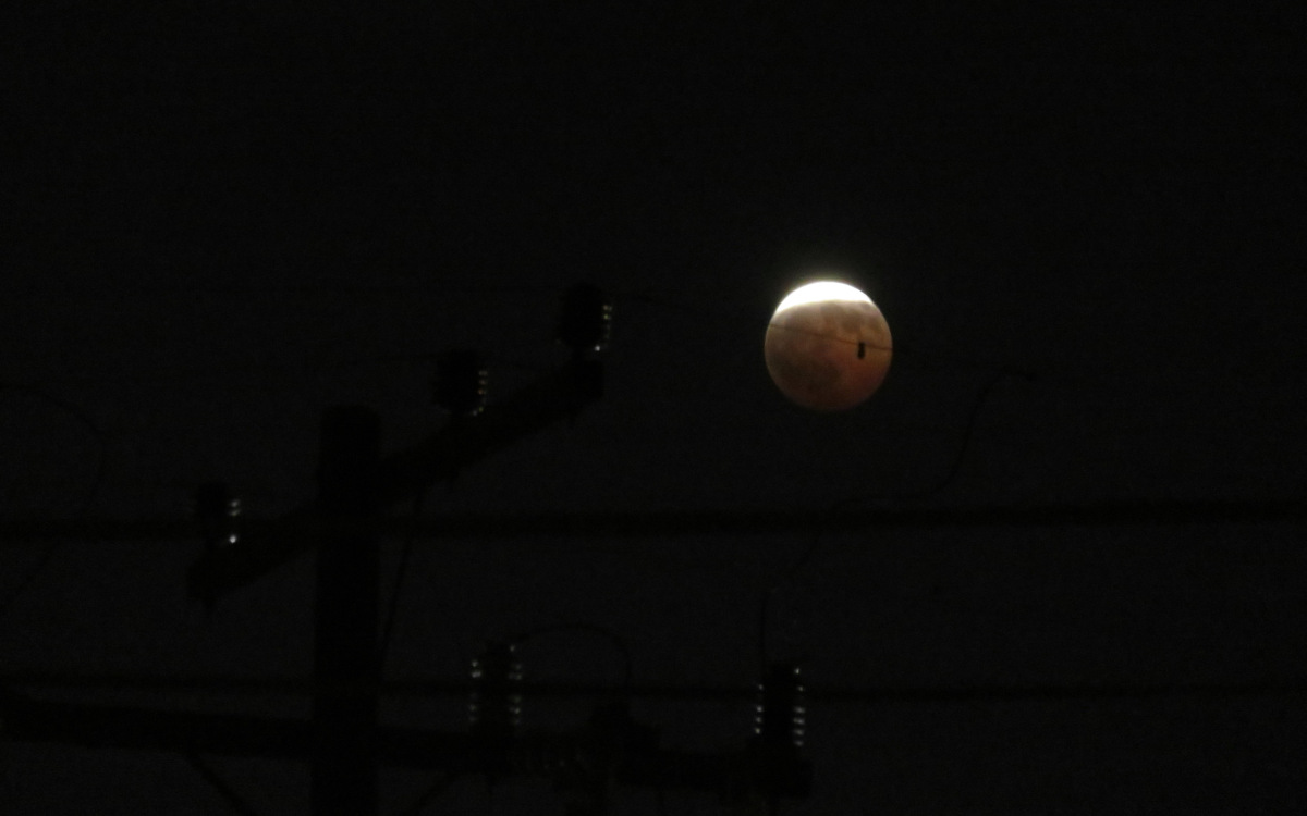
If you’re reading this close to when I’m posting it, the eclipse isn’t over yet. There’s still an hour or so before the moon completely passes out of Earth’s shadow. If you have clear skies and the moon is up where you are, go take a look!
Regarding Empathy
Over the last few years, right-wingers have finally started to realize that what they’re missing is empathy. Several decades’ worth of “I didn’t realize how bad this policy was until it hurt someone I know personally!” statements had already made that clear to the rest of us. “I didn’t think the leopards would eat my face!” as a meme goes back a decade now. But instead of realizing they should develop some, they’ve decided empathy must be bad, much like they previously decided that being aware of systematic injustice must be bad, and turned “woke” into a pejorative.
*sigh*
No, “Western Civilization” is not doomed by “suicidal empathy.” That people like Musk and Saal think “not treating people like garbage just because they aren’t like you” is an existential threat does not make it so. As Myers says, that tells you more about them than it does about society.
And if some aspects of our culture are threatened by empathy, such as the belief that certain types of people deserve to dominate others and other types of people deserve to be abused, then we should throw out those aspects, not cling to them even harder.
There are people who exploit vulnerabilities in society. But those people act a lot more like Elon Musk and a lot less like some random non-gender-conforming person who’s just trying to use the bathroom without getting beaten by a mob for picking the “wrong” one.
If our civilization is destroying itself, it’s not the people asking for empathy and inclusion who are doing it. It’s the reactionaries who insist on “taking back” their ability to treat others like garbage without consequence. They’re the ones tearing us apart.
Reusing the Sign: Com-On-Inn
Back in the 1980s or early 1990s, I remember a motel that dropped out of the “Comfort Inn” chain. They reused existing signage by picking the name “Com-on Inn,” so they only had to replace a couple of letters. Something made me think of it recently, so I went looking to see if it was still around, or if I could at least find where it was.
DuckDuckGo didn’t find anything with the name (though when I did an image search, the broader criteria came up with a number of Comfort Inn locations). The closest Google suggested was a “C’mon Inn” in Grand Forks. I knew the general area it had to be in, so I went looking on Google Street View for something that looked right.
And I found it! A few blocks from where I thought it ought to be, and the building looked slightly different than I expected. But it’s in Monterey Park, next to a 7-11 (which jogged a memory), and the 2007 street view image is just barely legible enough to prove that even if I remembered the wrong location, I was right to remember that it actually existed!

Between 2007 and 2012 it appears to have been rebranded as the Floral Inn, and sometime after 2017 it became a Motel 6.
Now I’m trying to think of other signs that have been reused like this. I know I’ve seen others! But at the moment, all I’m coming up with are entirely new signs placed in a distinctive rounded-triangle housing. I’ve seen enough of those that I seriously considered making a “Used To Be a Winchell’s” Tumblr in the previous decade!
Where to Put Your Permalink
On the Blaugust Discord, UltrViolet suggested that bloggers link their post titles to the permalinks so that it’s easy to just right-click, “Copy Link as Markdown,” and get a formatted link with the correct title. (I’ve noticed Orion includes this in its context menu, and there are extensions for Firefox and Chrome that add it.)
I’ve been using the publication date in the post footer as the permalink on all the 11ty-generated parts of my site since I first converted the Les Mis blog back in 2021. But I can’t remember why I made that decision. I’m 99% certain every WordPress theme I’ve used has linked the title (even this one, which links from the timestamp too). It wasn’t an example in eleventy-base-blog either.
My best guess is that I was just implementing the Fediverse’s convention of linking the timestamp to the permalink. But that’s almost certainly because all the Twitterlike services don’t have titles.
But in looking up linking conventions, I went down an interesting rabbit hole about rel="bookmark".
Anyway, it’s an obvious change for better usability, and I’ll be updating my templates ASAP. (Edit: it’s done!)
Grumbling about Planned Obsolescence
Sure, I like electronic gadgets. But I dislike planned obsolescence more.
It’s one thing when the newer model really is that much better. “All About the Pentiums” exaggerated it, but computer hardware in the 1990s really was improving by leaps and bounds. (And the software was devouring those performance gains, both in demanding more resources, and being less efficient as programmers were told to optimize for their own time, not for disk space or RAM.) That eventually settled out around the time smartphones and cloud computing started taking off, which is why I was able to run a 2012 model CPU all the way through 2024. A faster PC would have been nice, but I didn’t need one yet.
As I recall the tech industry freaked out when demand for new PCs dropped. There was probably a rash of “Millennials are killing computers!” articles.
But smartphones were going through the same kind of rapid improvement. You could easily justify buying a new phone after only two years: it was a lot faster, had a better display, had a better camera and more storage, and so on. And the carriers were happy to hand you a “free” new device to keep you on their service. Heck, if you really wanted (and could afford) to buy a new phone every year, you could make a case for it.
In that environment, you could kind of accept a company only offering 2-3 years of support for their phones.
Eventually that settled out too, and it takes longer for new phones to really be worth the upgrade. Of course the industry has tried to keep the pace going. If the hardware still works, and it’s still able to run the apps people want to use, there’s no good reason for the company to stop supporting it after only three. Especially with something whose main purpose is to be constantly connected to the Internet.
I have an Android phone from 2020 and a tablet from 2019. The tablet still works fine. (It’s great for digital comics, or PDFs that are pre-formatted for 8.5×11″ pages.) The phone worked until two days ago. (Technically it still does, but I don’t want to overload the already-swollen battery.) But they’re both unsupported. Not because the hardware has failed (up until Monday). Not, like the Poke3, because they can’t handle today’s apps. Simply because Google and Samsung don’t want to provide updates anymore. Not even bugfixes. Not even security fixes.
It’s maddening.
Especially with prices on new electronics skyrocketing due to the AI datacenter-driven RAMpocalypse.
There are many things I dislike about Microsoft, but I appreciate that they finally realized that a large chunk of their customer base can’t or won’t upgrade their hardware just to install Windows 11, no matter how they try to convince us, and has extended Windows 10 support twice with minimal hoops to jump through.
The Fairphone 4 (2021) that I pressed into service to replace the dying Pixel 5 (2020) is more or less comparable in terms of speed. I still need to experiment with the camera. But it’s still supported through 2028, meaning it’s safer to use online. Which, again, is what cell phones are for.