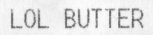
Here’s another long-delayed scan, from the cover of a holiday baking magazine:

Easy tarts? Apparently, you can have your cake and Edith too.
Here’s another long-delayed scan, from the cover of a holiday baking magazine:

Easy tarts? Apparently, you can have your cake and Edith too.

(In case you’re wondering, it’s a receipt item for Land O Lakes butter.)
Remember last year when I realized some net filter was looking at teentitans3.jpg, breaking the words in the wrong place, and concluding it must be adult content and therefore should be blocked? (It replaced the “offending” words with spaces, which get encoded as %20 in URLs.)
At the time I left it, since I figured anyone who installed a filter that brain-dead given the popularity of the Teen Titans cartoon deserved what they got. Well, the usability and “make the site work for the visitor” side of the debate finally won out (with a little help from “the people who use these filters aren’t the ones who install them”), and a few weeks ago I renamed the file to teen_titans_current.jpg.
Guess what? I’m now seeing hits for %20%20%20%20_%20%20%20ans_current.jpg.
Even when I give it word breaks, it can’t figure it out.
They’re lucky I called the file titans.html. Otherwise some people wouldn’t be able to see it at all.
Given this level of “quality,” can you blame librarians for opposing mandatory installation of filters on library computers?
Further reading: The Censorware Project, Peacefire, and Electronic Frontier Foundation.
Spotted this one adorning a mini-SUV in Irvine:

Bet you ten years ago this wouldn’t have made it past the DMV.

I’d seen an AOL CD packaged to look like laundry detergent before (Tide, specifically), but this seems to take it a step further.
I think what makes it seem strange to me is the fact that they made “Cleaner” more prominent than “AOL.” Sure, you can’t miss it, especially with the running man icon, and of course they’re plugging their filters and bundled antivirus (to clean your computer), but it just seems like they’ve taken the metaphor a bit far in the design.
I don’t remember when, where, or how long ago this was—or even which of us saw it—but I found it while cleaning the piles of junk off my desk this afternoon.

I mean, what’s not to like about this position? You get to work half to death for a “nasty boss”—he’ll even kick you around! Such thoughtful consideration, especially to tell you about it up front!
OK, that’s bizarre… I just read through the winners of last year’s Bulwer-Lytton contest (worst opening paragraph from an imaginary novel, named after the author who penned “It was a dark and stormy night.”) Naturally, much of the text is displayed in purple.
Now all the text on my screen looks green.
I think it’s time for me to get some sleep.