This is a story on phone menus, though it applies to anything where the user interface can change. I phoned in a refill on a prescription this morning. The phone system lets you choose when you plan on picking it up, presumably so that the pharmacy can prioritize people who are coming in sooner. Generally, it asks you to enter the hour, then #, then 1 for AM or 2 for PM.

I wanted to swing by around noon, so I entered 12, then #, and then without listening for the option, I hit 2. I wanted to pick it up around 12:00 pm.

So I was surprised to hear, “We’re sorry, the pharmacy is not open at midnight.” I flashed back to elementary school, when I was out on the field trying to explain to my friends why noon was 12 PM and not 12 AM as they insisted. Had someone managed to get into a programming position, without clearing that up?

As I re-entered the time, I listened for the options. It turns out that they had anticipated just such confusion, as after I chose 12, the option was, “Please enter 1 for noon, or 2 for midnight.” That works great for people who are using the system for the first time, whether they know noon is PM or not. Unfortunately, for people who have been using it for years and (normally) don’t need to listen to the options, it switches the buttons around. It’s like those WinZip registration dialog boxes that would rearrange the buttons every time, so that you couldn’t just click through, you’d have to pay at least some attention to it.

Of course, then there’s the question of why it even gives you the option for midnight…
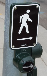
Walk button with raised arrow.I recently took a walk through some streets that have only recently opened to traffic. One of the things that struck me was that the buttons for triggering the walk/don’t walk signs had a new design. Instead of a tiny recessed button, or a larger rounded button, they had a ~2″ flat button with a raised arrow.
My first thought was, why the extra arrow? It’s pointing in the same direction as the sign. And it means you have to press the button carefully instead of just whacking it with your hand. The answer hit me later in the walk. I was leaning on the button with my hand when the light changed, I and felt the button vibrating. Of course! It was for blind pedestrians!

The raised arrow makes it easier to hit the right button, rather than just hope that the buttons have been placed in standard orientation. And vibrating the button makes it clear not only that it’s safe to cross, but in which direction it’s safe to cross. That’s one thing I could never figure out about the chirping walk signs in San Diego. It tells you the light’s changed, but if there’s any indication as to which light is green, I’ve never noticed it.

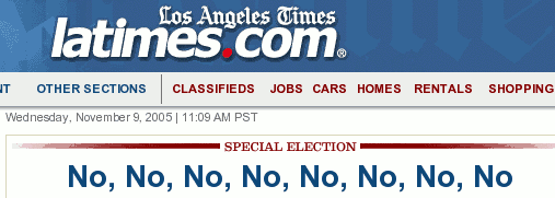
The Los Angeles Times website had an interesting way of describing the results of yesterday’s state election:

No, No, No, No, No, No, No, No

It’s hard to believe that all eight propositions failed. Even the four Orange County measures failed. Every item on the ballot in our district was rejected!

On a related note, I still don’t like the voting machines we have in OC. The interface is cumbersome and the display is godawful slow. The controls consist of a dial, which moves the cursor, and a button, which selects the current item.

The display is so slow you can watch it redrawing the title and summary of a ballot item when it highlights it. First the rectangle turns blue, then it redraws the text, line by line, in white. It’s like watching print preview in Word Perfect 5.1 for DOS on a 386. You just don’t see that kind of performance on modern computers unless they’re massively bogged down.

As for trying to use the machine, it’s kind of like entering your name in the high score list on an arcade video game with only a trackball and a fire button. I’m sure they chose it for durability reasons—a touch screen would be much more usable, but much easier to break—and went with the low-powered processor to keep the costs down.

I actually liked the punchcards we had before. It was so much more satisfying to slam down that lever.

From the Gnome 2.10 release notes:

In the past, while typing something into one application when suddenly your instant messenger offered a chat request from your friend, your words would be typed into the chat window. Imagine if you were typing your password at the time. This should no longer happen in GNOME 2.10.

In addition, if an application takes a long time to start, your work will not be interrupted when it finally opens its window.

About time someone fixed this! The window focus-stealing problem has plagued just about every desktop out there. I think Windows is the first one I noticed that attempted a solution (blinking the taskbar button instead of switching to the dialog box). And since I often fire up several programs at once, it can get really annoying when I start typing my password into one, hoping I’ll finish before the other window appears and drops the last three letters into my web browser or something.

Unfortunately I’ll probably have to wait for Fedora Core 4 to really use it, unless I want to go even more bleeding-edge than I already am.

Here’s a pair of excellent articles about how to avoid cluttering up your website so that people can actually see your content. The article is, however, hampered by appearing on a site that seems to violate every usability principle imaginable…. to the extent that the second one showed up on the Cruel Site of the Day. From the introduction:

We’ve all visited websites that made us wince. You know what I mean: full of distracting animation, flashing text, and enough other clutter that it reminds you of a Victorian home filled to bursting with knick knacks. Are you guilty of filling your website with useless junk? Christian Heilmann takes you down his checklist of website clutter. You just might find yourself considering a redesign.

Yeah, that sounds like a description of Dev Articles to me. I count no fewer than 8 ads on the first page, 6 of them animated. The text is buried in a morass of advertisements and navigation that make it extremely difficult to actually read the article.

It reminds me of a book called Fumblerules, which collected (or possibly originated) guidelines like “Always proofread carefully to make sure you don’t any words out,” or “Plan ahead” with the last few letters scrunched together to fit on the page. These were designed to make their points by deliberately breaking the rules to make them more memorable.

Well, there’s always the Daily Sucker.

Update: I checked out the author’s website, which demonstrates he has the sense of taste and aesthetics one would expect from his articles. It really is too bad DevArticles isn’t willing to take his advice.

As one of the many working stiffs who can access the internet from work but has to share a connection, I would like to make a request of the corporate world at large:

STOP REQUIRING FLASH TO VIEW YOUR SITE!!!!!!

Everything I look at on the net while at work has to go through a server in northern CA, which doesn’t have Flash capability and probably never will, because it would be even slower if the 250 people using it were allowed to view bandwidth-hogging all-Flash sites. With the economy being what it is, bandwidth costs being what they are, and connection power needing to be split at most offices, I’m not sure any company should be upping the ante this far in the name of pretty pictures. And the defense that people can look at it at home isn’t too great, either, since DSL is out of reach of more working stiffs than web geeks want to admit, and Deity-of-Your-Choice only knows when it might creep into affordability.

So, please do what you used to do, and keep your non-Flash site online after the upgrade, instead of routing us to a page exhorting the wonders of Flash and attempting to bully us into downloading it. (Baaaa.) You’ll widen your audience with very little effort–and hey, aren’t non-Flash sites easier to maintain?

ยปAll pages site-wide with this tag