Usability researchers like Jakob Nielsen have long contended that people read differently online than on paper: they tend to skim, follow links, and jump off quickly if they don’t find what they want. (Rather than being judgmental, Nielsen simply advises that you tailor your online writing to this.)

Now the Washington Post reports that people are observing a spillover effect, with online skimming habits interfering with concentration when it comes to more in-depth reading…even when reading print.

Sadly, the article mostly distinguishes between two modes of reading:

  • Online skimming of casual articles and social media on screens.
  • Serious reading of novels and in-depth content in print.

There’s nothing to distinguish, for instance, reading on a dedicated e-reader (without the siren call of Facebook or hyperlinks) from reading on your laptop. Nor is there anything to distinguish casually reading on your phone’s tiny screen from reading at your computer, or sitting on the couch and reading on a book-sized tablet.

A tablet and a breaking paperback.

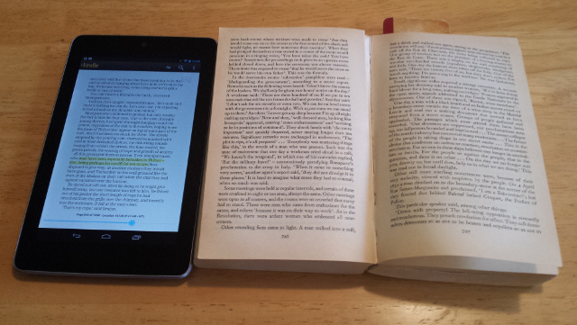
Personally, I’ve found display size to be the biggest factor in maintaining attention. I get tired of reading on my phone, and I tend to skim on a desktop or laptop, but a handheld tablet (I have a Nexus 7, which is close to the size of a paperback book) works out about right. I’d much rather read a long article on that tablet than on a computer, even with the browser window sized for optimal column width.

So yeah, it’s much easier to concentrate on something long in a book than on a desktop or cell phone…but an ebook reader or a tablet is a lot closer.

There are still tradeoffs: My Les Misérables re-read changed drastically when I switched from a paperback to my tabletnot because I couldn’t concentrate on long passages, but because my method of notetaking changed. My reading actually sped up, but my commentary slowed down. (It did ultimately take me longer than I expected to finish the book, but only because I had so many other books I wanted to read, and ended up taking breaks and reading them instead.)

The main problem I do have with a tablet isn’t continuing to read, but starting to read. Even without a wifi signal, it’s tempting to catch up on email, or saved articles in Pocket, and before I know it, I’m done with lunch and I haven’t even opened the book I’d planned on reading.

(Via Phi Beta Kappa)
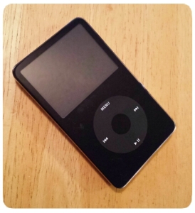
Randy Cassingham of This Is True has been driving a weekly Twitter event he calls Pet Peeve Wednesday, with the hashtag #PPW*. Some items I’ve posted about things that Just Bug Me(tm). I guess I shouldn’t be too surprised that they fall into two categories, tech and language.

Tech Annoyances

  • Mobile websites that change the URL so you can’t reshare the page on Twitter without sending desktop users to the mobile site. Or worse: the ones that redirect you from a full article to the front of their mobile site, so you have to hunt around for the article that someone was trying to share with you.
  • New password forms should always spell out the password policy before the user tries to pick something it doesn’t like.
  • If you have to cite a bogus law to claim that your email is not spam (or worse, that recipients can’t callit spam), it’s spam.

Language Annoyances

  • “Weary” means you’re tired of something, not concerned about it. You’re thinking of “wary” or maybe “leery.”
  • If you’re going to reference “Wherefore art thou Romeo?”, remember: she’s asking why, not where. (Think of it this way: The answer to “wherefore?” is “therefore,” and you know what “therefore” means.) It’s a lead-in to the “What’s in a name?” speech.
  • What do people think an “intensive purpose” is, anyway? The real phrase, “for all intents and purposes,” at least makes sense.
  • The word is “foolproof,” as in even a fool can’t mess it up, not “full proof.” (As opposed to what, half-proof?)

*There’s a hashtag collision with both “Pet Peeve Wednesday” and “Prove People Wrong” using the same tag.

Wow: A researcher studying the way people use computers found that most people don’t know how to search for a word on the current page!

Crazy: 90 Percent of People Don’t Know How to Use CTRL+F

Google’s resident search anthropologist, Dan Russell, dropped this incredible statistic on us. And no, he couldn’t believe it either.

To someone used to using computers, it seems so basic, but I guess if no one shows you it’s there, it’s the kind of thing that’s not easy to discover on your own. (via Slashdot)

The article doesn’t actually say which side of the 90/10 split people using toolbar buttons or menu items to search fall on, but it does mention people paging through an entire document to look for something by eye.

If you’ve been following the Firefox 4 betas, you’ve probably noticed that they’re dumping the status bar. OK, a lot of people didn’t use it, but here’s the thing:

When you hover over a link, the status bar tells you where it will take you.

This is important (especially for security) — important enough that they’ve moved the functionality elsewhere…but in a broken manner. They’ve put it into the location bar — you know, the field where you type in a URL, or look to see where you are.

The problem is that there isn’t room in the location bar to show the full URL of a hovered link except for very short links. The status bar has the entire width of the browser. The location bar has to share that space with the navigation buttons, the search box, the feedback button (during the beta), any custom toolbar buttons, the site name on secure websites, etc.

Just about every link I hover over ends up with critical information cut off in the “…” between the start of the hostname and the parameters at the end. That’s almost useless. (Almost, because at least the hostname is visibla, but it would help to see the page name as well.)

Displaying the target URL in some way is core functionality for a web browser, and you shouldn’t remove or break core functionality. In some ways this is worse than the proposal a few years ago to remove “View Source,” because that at least isn’t core functionality for a browser (though it is core functionality for the web, because it encourages people to explore and tinker and learn how to make their own websites — which is exactly why that was put back in). It’s crazy that I need to install an add-on to get back something as basic as a working preview for links.

I suppose I can understand putting one of those “If this is an emergency, please hang up and call 911” messages on a health insurance phone menu. But if you’re going to have one, shouldn’t you put it before the five-minute member identification/sign-in process, not after?

Admittedly, the process only took that long because their voice recognition system wasn’t getting along with my voice, but still, isn’t the point to route people to the fastest response in an emergency?

Serious stuff (news, usability, history, etc.):

And not so serious:

  • Fantastic image: Firefly crew as the Enterprise crew. Classic Star Trek, of course. One thing that really struck me was the reminder that there’s really only one woman among the regular classic Trek cast: Uhura. Nurse Chapel and Yeoman Rand are there, but neither of them would really have had the kind of focus that Kaylee, Zoe, Inara and River have here.
  • Incredible custom action figure maker Sillof collaborated with Glorbes on a Star Wars in World War II series.
  • The webcomic SMBC presents: The Logogeneplex! I’m pretty sure I’ve read stuff that this was used on. (Warning: archives are NSFW.)

ยปAll pages site-wide with this tag