A few nights ago I was walking around sunset, and decided to look for something that had been mentioned last week on the Astronomy Picture of the Day: the Belt of Venus.

Somehow I’d never noticed that after sunset, the band of red encircles the entire sky at the horizon. Even more amazing, if you look away from the sun you can actually see the Earth’s shadow on the sky as a slightly darker blue below the pink. It reminded me of the view of Mauna Kea’s shadow on the cloud layer below. Oddly, though I didn’t pay any attention to it at the time, the Belt of Venus is clearly visible in that photo!

I guess at sunset I’m most likely to be looking at, well, the sunset. Or focusing on whatever it is I’m doing at the time.

This was Thursday night, so the moon was almost full. It rose just below the Belt of Venus, just inside the shadow. So close to the horizon, the moon illusion was in full effect, and it looked huge!

And me without my camera. *sigh*
We have four coffee-house chains in the area, in addition to local places.

My favorite is Diedrich Coffee, with a couple dozen locations in Orange County, two each in LA and San Diego… and three each in Houston and Denver. (In the last few months, Diedrich has started selling T-shirts that say, “Venti, Schmenti.”)

Then there’s Kelly’s Coffee and Fudge Factory, which had about five locations the last time I checked but now has about thirty scattered around Southern California with one more in Lake Havasu… and according to their website, they’re opening one in Riyadh. Yes, Riyadh.

And then there are the international chains. Coffee Bean and Tea Leaf is all over the American Southwest and Southeast Asia. Starbucks, of course, is everywhere.

At one point we had all four chains in one mall. The first phase of the Irvine Spectrum had a Diedrich Coffee attached to the Barnes & Noble, before the bookstore hooked up with Starbucks. The second phase added a Coffee Bean. The third phase added a Kelly’s, and the Barnes & Noble moved to the new section… and added a Starbucks coffee bar inside. Unfortunately the Diedrich’s was off in a corner, and without the bookstore to bring people in, it eventually closed.

Edit: I can’t believe I forgot these, but if you really look for them, you can find Peet’s and Seattle’s Best. Neither has many stores in the area, though.

Neil Gaiman weighs in on the flap over adult-oriented comics in a Denver Library:

It’s been twenty years, and newspaper headlines still oscillate between “Wham! Bam ! Pow! Comics Have Grown Up!” and “OH MY GAAAD THIS COMIC NOT INTENDED FOR CHILDREN HAS CONTENT NOT INTENDED FOR CHILDREN IN IT!” articles. Bizarre.

(Ironically, the people complaining don’t seem to care much about the content—they just wanted to get the Spanish-language books off the shelves.)

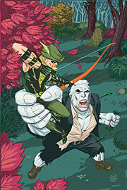
Green Arrow 53 CoverI just discovered that this week’s Green Arrow #53 is actually written by William Messner-Loebs. (DC’s website still says Judd Winick.)
Messner-Loebs and his wife have been in terrible financial straits for some time. An article about their plight last January led to fan mobilization complete with donation drives, benefit auctions and books, and—most importantly—a campaign to convince publishers to start hiring him again.

I’ve already ordered The Three Tenors: Offkey from Äardwolf Publishing and Heroes And Villains: The William Messner-Loebs Benefit Sketchbook from TwoMorrows Publishing. Neither has arrived yet, though they’re supposed to have come out last month.

Now I’m off to the comic store to pick up Green Arrow.

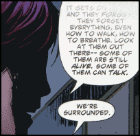
Mnemovore #5 came out this week. (For some reason issue #4 shipped twice—once just before Comic-Con and again last week.) This week’s issue, or at least my copy, has a strange quirk to it. Some of the word balloons are faded, as if a rubber stamp was pushed down with unequal force, or as if someone ran a gradient tool over the text with Photoshop. I’m still not sure whether it’s intentional or just a coloring or printing error.

This scan should be relatively non-spoilery:

Panel showing faded word balloon

At one point I thought they might be the result of coloring gradients applied above the word balloons instead of below, but I could only get a few to match up.

The thing is, it’s appropriate for the book—if maddening to try to read. The premise is that into our information-saturated world has come a predator that feeds on information, eating people’s memories and leaving them amnesiac or worse. In a story about information loss, gaps in information make thematic sense. And there was one panel with the same effect last issue: “They can make it so you can’t…”

Just one issue to go…