Category: Entertainment
OC D&D
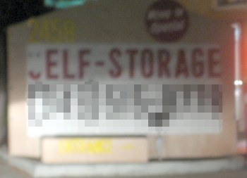
Something like 10 years ago, Katie saw a self-storage place in which the opening S was unlit, making it read, “Elf Storage.” She’s been looking for another one ever since, and we finally caught one in Newport Beach a few months ago. This one was even better, because the S had actually fallen off.

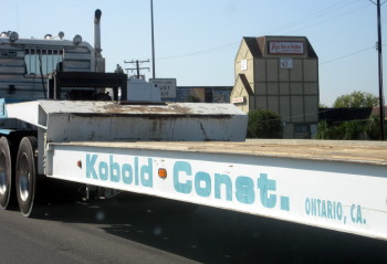
Of course, there are other things in the area that could easily come out of a Dungeons & Dragons manual. Such as this Kobold Construction truck.

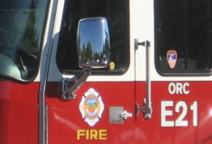
And then there’s the fact that all fire engines in Orange County are labeled ORC.

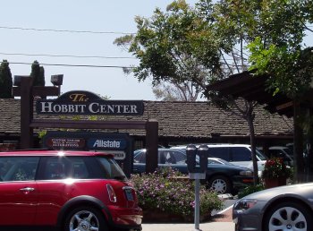
Let’s not forget the previously-blogged Hobbit Center in Laguna Beach.

And that’s not even getting into all the Tolkien-inspired street names in Lake Forest…
Saftey First – En Español
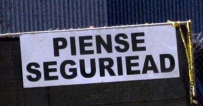
Just to show that English-language sign writers don’t have a monopoly on misspellings, here’s a sign we spotted at a construction site in Irvine:

Literally it means “Think Safety” — or it would if it said “Piense seguridad.” The typo makes this the Spanish equivalent of “Saftey First.”
Knowing too much
Finally watched A Scanner Darkly this weekend. Better than I expected. One sequence pulled me out of the film, though, and only because I live in Orange County.
In the middle of the film, several characters start a road trip to San Diego. They start on the 5 freeway in Anaheim and drive south until the car breaks down in Irvine. Then they ride in a tow truck back up to Anaheim.
The problem: They used real backgrounds of that stretch of the freeway, but showed them out of sequence. Shots alternate between characters as they hold a conversation.
First you see the squarish beige office buildings lining the freeway near Jeffrey in Irvine. Then you jump 3-4 miles north to the edge of Santa Ana, where you can see a blue glass-lined building in the background near Fourth St. Then you jump back down to the beige buildings. Then up to Santa Ana again. Then down to the office buildings. Back up to Santa Ana. Down to the office buildings again, which finally give way to The Market Place (you can see the giant purple sign as it goes past).
Now I understand how all those Chicago residents felt watching The Dark Knight.
Although thinking about it, it probably wouldn’t have bothered me if it had been set somewhere generic, and just happened to use local backgrounds.
Sex-Linked Brand Names
DC Comics recently canceled its Minx line of graphic novels aimed at teen girls, leading to much discussion amongst comics bloggers. I don’t want to talk about why the line folded, but why the line existed in the first place. Why did DC create an entirely new brand in order to go after this audience?
A big advantage to creating a new label: no preconceptions. Prospective readers won’t look at the cover, see a DC logo, and wonder where the super-heroes show up and rip off people’s arms. And they won’t see a Vertigo logo and assume that it’s a “mature readers” book. On the downside, a new label has to build its credibility from the ground up, instead of starting with name recognition.
This got me thinking: an established brand associated with customers of one gender creates a new brand in order to target the other half of the population. Where else have I seen this?
I own a jacket labeled Claiborne, which is of course made by the Liz Claiborne company.
Mervyns sells (or used to) H&H Men clothing, which was clearly a variation on their Hillard and Hanson brand.
All the examples I could think of (other than Minx itself) were companies that had traditionally been aimed at women, but were adding lines aimed at men. It made me wonder: is it the names? Do men feel odd buying a product named “Liz,” while women are used to buying brands named after both men and women? (Sara Lee notwithstanding.) Maybe it’s the stigma of a man participating in something perceived as feminine? Sort of like the assumption in children’s TV that boys will only watch shows about boys, while girls will watch shows about girls or boys (so they make shows about boys instead of girls, figuring they’ll get a bigger audience).
Then Katie pointed out LEGO Belville, the line aimed at girls which entirely misses the point of LEGO by making as much of each set prefab as possible. And pink. On the plus side, unlike Claiborne, Belville doesn’t try to hide the fact that it’s a LEGO product.
That makes it more like Men’s Vogue, a copy of which is sitting in the lunch room at work. In this case they’d have to call it something different (unlike a clothing line) because it’s not just a brand, but the title of the magazine.
I still think the craziest example of this has to be Men’s Pocky. It’s a cookie. One which I’d hardly consider a “girlie” cookie, but maybe it’s more associated with girls in Japan. I still can’t figure out whether it’s a case of cultural translation or deliberate absurdity.
Mastercard Chase: SDCC Security Snafu
A very long story about the adventures of a credit card at Comic-Con. May be funny someday. Continue reading
Frostbite Looks Familiar
Looking at the “all ages” shelf in Borders, which seems to be almost entirely made up of novels about vampires and dragons, I noticed that the cover to the Vampire Academy novel Frostbite looked awfully familiar. I walked over to the DVD section of the store and picked up a copy of Buffy the Vampire Slayer, Season 2.

This may be the most recognized image from Buffy the Vampire Slayer, and I just could not believe that the cover designer would copy the layout so closely.